Thursday, September 26, 2013

Make It Better Brainstorming Period

Jump Rope

1. Brainstorming

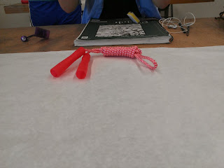
Our group chose a jump rope for our object.

We first looked at the object and and decided what we did and did not like about it. We decided that the handles and rope were too flimsy, it was not easily portable, and was it was not long lasting or durable.
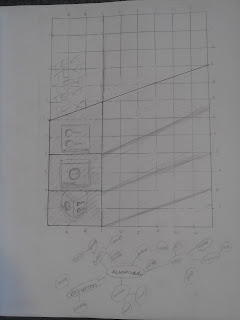
This is our mind map which we used to think of ways the jump rope was bad and ways it was good.

Next, we created categories like eco-friendly, color, material, handles, and rope on a piece of paper and added ideas on sticky notes underneath them on ways in which each category could be improved.


This is our brainstorming session almost finished. 


These are the temes we ended up deciding on: fun, eco-friendly, and accessability.

Objectified Reaction

   Objectified is my favorite video we have watch so far in this class. Seeing the way people in a field similar to the one I will eventually be in view the world was enlightening. I came into the program at KU with the idea that everything around us has been designed in one way or another, but seeing the way they are designed and how much work goes into every product that is marketed was interesting. I especially liked learning about how and why the exterior of Apple products are designed because the whole Design department uses them on a daily basis.
   Seeing why things are designed in a certain way was also interesting. Design has to be targeted towards the human consumer, so a lot of psychology also goes into designing products. I found this especially interesting because my third choice in major was psychology. When looking at an object you have to consider it's formal relationship, the cultural symbolism of the object, and the way it is used. Through this video I learned what factors to take into account in the "Make It Better" project.

Deep Dive Brainstorming Reaction

   I found the process used to reach the final project in Deep Dive very helpful when brainstorming ideas on how to redesign our group's object, a jump rope. The initial throwing out of any idea without judgement helps to make all of the members in the group feel comfortable and get every possible idea out, no matter how eccentric. I also enjoyed seeing IDEO members work together without a clear leader. This technique was something I had not seen before and seemed to work better than if a leader was designated.
    The final product that IDEO worked was much more efficient than other shopping carts. Not only did the redesign the cart itself, they redesigned the way the cart could be shopped with by adding removable baskets. They took efficiency, aesthetics, and safety into consideration for their design making a product that was not only more useful, but more pleasing to look at. I especially liked the hooks on the cart showing that the process of unpacking the cart was also taken into account. Watching IDEO's process and employing it helped my group come up with the themes we wanted to apply to the redesign of our object: environmentally friendly, durability and portability, and enjoyment.

Thursday, September 19, 2013

Objectified Documentary - Notes


Objectify
·      We judge objects as soon as we see them
·      Object speaks about who designed/manufactured it
·      First emperor of china – waging war to colonize
o   Each of archers made their own arrows so they couldn’t share arrows
o   Standardized design of arrows so each arrow would fit any bow
·      From the moment we wake up everything we see has been designed one way or another
o   Every object has a story
·      Japanese toothpick
o   Serrated edge that you can break off to show it was used and can be a stand for it
·      “Every object tells a story, if you know how to read it.” –Henry Ford
·      design tries to understand people and what their needs are
o   my thoughts: I like psychology too and almost majored in it so that’s cool
o   look at the extremes so if you understand extremes, the middle will take care of itself
·      Betsy’s pealer and Sam’s idea
o   Making it work for people with arthritis = good for everybody
o   Rubberized bicycle grip
·      Starting out a project
o   Look at how the object is wrong
o   Develop models
§  Physical and digital
·      CAD – computer added design to make digital
o   Rapid prototyping
o   “lets put great design into every day things and make these gadgets work better”
§  without people thinking about it
·      Dieter Rams
o   Design bonsai trees
§  So birds can fly in
o   Designing nature
o   Design is positive when clear and understandable
o   American company that takes design seriously – Apple
§  Products give a very clear sense of the people who designed it and made it
·      Apple/Design as a story
o   First imac
o   Think how do we connect to the product
§  Gets design out of the way
§  Not just arbitrary shapes, feels almost undesigned
o   Macbook air creation
§  Push themselves on – can we do the job of six parts with one
§  1 part provides so much functionality and enables product
§  important in a product to have a hierarchy
§  an indicator has a value if it is indicating something but if it isn’t indicating something, it shouldn’t be there
·      design moving from tangible to intangible
o   creates conflicts within design
o   3 phases of modern design
§  looking at the design in a formal relationship
·      form begets form
§  symbolism and content of what you’re dealing with
·      the rituals that make up using things
·      cultural symbolism
§  looking at design in a contextual sense
·      looking at human and object relationship
o   cone vacuum
§  unobtrusive
o   dyson vacuum
§  color introduced to it to articulate the various components of the vacuum
o   rhumba
§  relationship is to room it is cleaning, not to humans
§  bionic hamster
·      attach hamster to it and hamster moves it
·      Design’s Relationship to form
o   Design is creating an environment that makes people feel good
o   Removing anything that is unnecessary to create unity instead of discord
§  Close to composing music
·      Designing new things
o   Satisfaction motivates us
o   Goal as a designer is to look into the future and see what is going to happen and not what has happened
o   Design should be trying to offer products that you want to keep and that you feel will stand the test of time
·      Design as an enterprise
o   Design has become a way for companies to add value and charge more money for it
o   Things will be marketed in terms of design in the future
o   Elitism and the idea of design
o   Target
§  Influenced pop culture thinking about influence and culture of design
·      Good design distinguishes you and is a mark of progress
·      Knowing it sets you apart as modern
§  Target lets you buy into good design and good taste easily
o   Good design comes from the need of companies to make more stuff and the reasons why people will buy them
o   Why we wont new things
§  Can do something different
§  Focused on now
§  Not focused on forever
§  Making new now look like then so people will buy the new now?
·      Cars
o   Cars are frozen in time so the observer can look at it and put motion in it by the way you scan it
o   Has to be a reflection of motional energy
o   Cars have a face
§  One expression forever
o   Challenges of car design
§  Assessing what cars will mean in the future
·      Will they be an expression of yourself or fade into the background as just a mode of transportation
o   Real audience is ourselves – why is this the right car for me? – making a statement to yourself about yourself
·      Mass Production of Design - Karim Rashid
o   Using industry to produce serialized goods
o   Techno organic world – organic but using new technologies
§  Physical interpretation of the digital age
o   Archetypes
§  Cameras
·      Film designs the shapes of the camera but our cameras don’t use film anymore so why are they still rectangles?
o   70% of the world is uncomfortable
·      Interaction Design – (name by) Bill Moddridge
o   Obsessive sketch
§  When the poets statements are obviously visible the audience may become uncomfortable
§  Audience wants to be drawn into the poet’s world
§  Things are most natural when you don’t think about them
§  Designers need to be plugged in to natural human behavior
·      Sustainability
o   Trying to produce more and more stuff that we need and don’t need
o   Creating for 10% of people who don’t need more stuff when the other 90% are trying to afford to meet basic needs
o   Have to also design a way that products can be disposed of in an environmentally friendly way
o   Most of what you design ends up in a landfill somewhere
§  Doesn’t really occur to us as a society but now to be a designer you have to be aware of it
o   If shelf life is less than 11 months than it should be easily disposable
o   What we do is not how we create the individual design, but what happens after it is done and people have used it
o   Thomas Overthun
§  Toothbrush
·      Small object creates a big piece of landfill only months after it is created
·      Trying to use one handle your whole lifetime
o   Just replace heads
·      Design is a way to systematically ______
·      Design uses mind maps
·      Jane Fulton Suri
o   Looking at people for inspiration
o   Trying to make an empathic connection with people in their context
o   People are not satisfied with what they buy, they change them for their own use
·      Designers as the intellectuals of the future
o   Designers designing scenarios based on objects that help people understand the consequences of their actions
o   Robots
§  As devices become more intelligent make the objects dependent on humans
o   Design connects the world
o   Designers are far removed from the object
§  Object designed in another country
§  Makes the object seem too easy and too superficial
o   Most meaningful objects are the objects that matter and tell your story

Friday, September 13, 2013

Process of Making My Poster

The first thing I did was Google Swedish poster designs for inspiration. I drew a lot of my inspiration from the following posters.


Then I started laying out ideas in my sketchbook.


 Preliminary Gridded sketch done in class.

 
Word map done in class to think of words to put on the poster and ideas to incorporate.


First InDesign mock up, done in class. I was trying to repeat the rectangles and did not have the words I planned to use decided yet. Done in class.


Final idea done inside and outside of class on InDesign. I changed my idea from just repeating the rectangles to trying to have the illusion of the alarm clock folding out. I also tried to repeat the circles on the side of the alarm clock (the knobs for volume and tuning) by choosing words with at least one O in them.


I used Thesaurus.com to find synonyms to words that described my object, like smooth and simple, that had the O's I wanted in them.


I had my pictures shot in the photo lab in the Design building. I had them shot at kind of the angle that the shape was trying to convey. I then Photoshopped them to be less yellow and more uniform and put them into my file.


 I then built my poster outside of class. I made a couple more tweaks before I turned it in because I cut the far left picture upside down, so the words didn't fit correctly.


Thursday, September 12, 2013

Design Q & A with Charles Eames - Reaction


      Eames' view that design is a solution to a problem is a view on design that I have not heard before but strongly agree with. I also liked his explanation of design by saying it creates useful objects and that it dresses itself to the need of consumers because I had also not of design in this way and it makes me think of design more purposefully. His claim that computers can rarely substitute and merely aid designers also validated my love of design. Although I disagree with his claim that most design is ephemeral because there are many posters and graphic elements that stay timeless and come back in style as new styles like "vintage" and "retro." As a side note: I found the single french accent very distracting to the purpose of the video.


Don Norman: 3 ways good design makes you happy - Reaction

     I enjoyed Norman's approach to design and his belief that the purpose of design is to make you happy. His belief that objects do not have to be functional to be "well designed," although ideological, clashes with Dieter Rams' idea that good design mush be functional as well as useful and aesthetic. Although I appreciate Norman's enthusiasm and concede that all the things he presented were well designed, visually interesting, and pleasing I agree more with Rams' idea that design should be purposeful. Even so, if you consider enjoyment the purpose of the objects Norman showed they fit more easily into Rams' ten principles of good design. These two different ideas of design gave me a better grasp on the idea that design can really be whatever you want it to be, which I think will encourage me to believe more in my own ideas and designs.


Why My 5 Objects are Good Design According to Dieter Rams' 10 Aspects of Good Design

Alarm Clock


Useful: It is a multipurpose object. It shows the time, has 2 alarm settings, and plays the radio. 
Aesthetic: The buttons and knobs are designed in a uniform and easy to use form way as well as a way that is pleasing to look at. The repetition of circles and squares brings the design together.
Understandable: This product's use is clearly defined without any extra or extraneous details or features.
Unobtrusive: This object serves its purpose without simply without being overly decorative.
Honest: This object does not claim to be anything or serve any other purpose than being an alarm clock.
Long Lasting: This product is durable and since none of the buttons are made of soft plastic the buttons are unlikely to wear out or wear off of the body.
Down to the Last Detail: Every detail of this object was well thought out, none if it is sloppy or seems half finished. 
As Little as Possible: There are no extra or unnecessary features or parts to this object. Everything serves an obvious purpose


Teacup


Innovative: This object holds hot liquid without burning your hand. The thick ceramic material and handle block the heat from getting to your hand.
Useful: This object holds hot liquids without letting the heat reach your hand.
Aesthetic: The curve of the handle and body of the cup in contrast with the angle at the top of the handle on this object are a pleasing contrast.
Understandable: This object is obviously a teacup. There is no confusion about what it is for.
Honest: This object promises nothing except to hold your liquids.
Long-Lasting: Although breakable, this material lasts longer than if you were to use a paper cup for your tea or coffee. 
Environmentally-Friendly: By using this object you eliminate wasting paper cups.


Crazy Straw


Innovative: Because this straw is plastic it can be reused, saving consumers money.
Useful: This product is useful because it can be reused. 
Aesthetic: The light blue color of this object and the balance of the two curls are pleasing to the eye.
Understandable: The use of this product is realized as soon as you look at it.
Long-Lasting: This product lasts much longer than a normal paper straw.
Down to the Last Detail: The balance of the two curls show attention to detail.
Environmentally-Friendly: This product eliminates the need to buy disposable thin paper or plastic straws.

Spoon


Innovative: This spoon is innovative because it is made of a harder plastic so it can be washed and reused or thrown away. It also makes it easier to eat hard foods like ice cream which usually break thin plastic spoons.
Useful: This object helps you eat food.
Aesthetic:  This object is aesthetic through the even and calculated curve of the handle.
Understandable: This object is obviously a spoon. 
Unobtrusive: There are no decorative aspects to this object. It is simply a plain, cream spoon.
Honest: This spoon does not pretend to do anything but help you eat. There can be no misgivings about what this object does or is for.
Long-Lasting: This object is durable and can be washed and used again.
Down to the Last Detail: This object is well thought out. The curve of the handle fits your hand easily and the depth of the end is proportional. 
Environmentally Friendly: This object can be either washed and used again or thrown away if it becomes damaged.

Sock

Innovative: This object blocks your feet from blisters and keeps them warm.
Understandable: This object is obviously a sock.
Honest: This object does not pretend to be anything else but a sock or do anything besides its designed purpose.


Vitsoe Dieter Rams: ten principles for good design - Reaction


     I found the Dieter Rams "What is Good Design" article very informative on what design encompasses and what constitutes good design which helped me choose my five well designed objects. The different objects that were pictured illustrated that design can be a part of things other than pages in a magazine or on a website. The descriptions gave clear and concise defenses for why each aspect of design was important and relevant. The quote “an impenetrable confusion of forms, colours and noises” from the article really resonated with me because it illustrates the effect that design can have on the world and its ability to shape our culture as well as the responsibility designers have to shape it in a positive way.

Color Police


Bad Color Design


This is an example of poor color usage through the use of only strong chroma, excluding the title. The title, although it is weaker chroma still does not stand out from the background because of the extreme use of high chroma. This poster does not have a color scheme, it simply uses every color on the color wheel. If less colors were used and at a lower chroma level and the title did not have a 3D effect this poster could have been more effective, although it would need a complete re-design to be well designed.

Good Color Design 


This magazine cover is an example of good color design through the use of neutrals with some low chroma pop color. The green adds some color to the neutral to keep the design from being boring. The color successfully makes the "home" look inviting, calming, and lived in, but still new and fashionable.

Monday, September 2, 2013

Color Lecture


Limited Color Palette
This picture shows limited color through the use of only different shades of green.


Harmonious Chroma
This picture shows harmonious chroma through the use of the same levels of chroma in the solid colors.


Harmonious Values
This photo shows harmonious values through the same lightness of shade in the V and light blue.


Harmonious values
This picture shows harmonious values through the same levels of value in the red and blue as well as the secondary colors.


Harmonious Chroma
This picture shows harmonious chroma through the same level of chroma in the purple, red, and green.


Contrasting Hues
This photo shows contrasting hues through the use of yellow with blue, which are far apart on the color wheel.

Harmonious Chroma
This picture shows harmonious chroma through the use of the same level of chroma in the blues and red.


Key the Color
This poster uses a red filter to harmonize the colors and make the white title and 2013 stand out.


Key the Color
This poster uses a yellow filter to harmonize the colors. The yellow light behind the people to highlight them as the focal point.


Use of Neutrals
All of the colors in this picture have a low level of chroma and are basic colors.


Limited Color Palette
This picture has a limited color palette of blue through the use of different shades of blue in every element.


Harmonious Chroma
All of the elements of this picture have the same level of chroma.


Transitions in Value
In this picture the values go from dark to light.


Contrasting Chroma
This picture shows contrasting chroma through one dark, high chroma shoe and one light, low chroma shoe.


Contrasting Chroma
This picture shows contrasting chroma through the light, transparent, low chroma blue and the high chroma dark blue.


Contrasting Hues
This picture shows contrasting hues through the colors green and orange, which are across from each other on the color wheel.


Use of Neutrals
This picture shows the use of neutrals through all the washed out, low chroma, basic colors.


Limited Color Palette
This picture has a limited color palette through the repeated color orange.


Contrasting Values
This picture shows contrasting values through the gray of the shirt in contrast with the red of the heart.


Contrasting Chroma
This picture shows contrasting chroma through the low chroma of the yellow background and the high chroma of the pink words.


Harmonious Values
This picture shows harmonious values through the similar values of the rugs.


Dominance of Hue
This picture shows dominance of hue through the use of neutrals plus the red, which dominates and stands out.


Dominance of Hue
This picture shows dominance of hue through the use of neutrals plus the blue, which dominates and stands out.