Thursday, April 30, 2015

P2 Refinements and Booklet Explorations

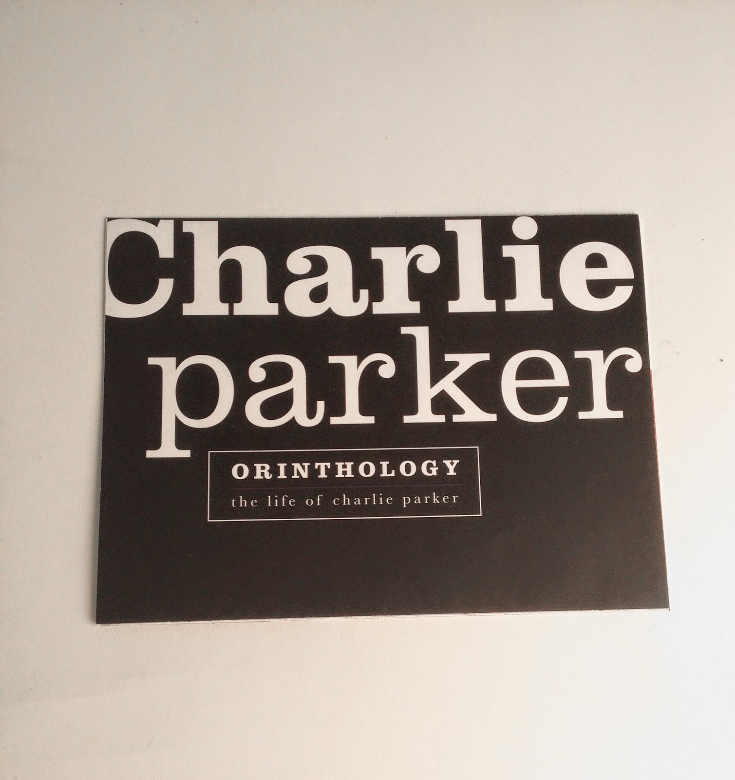
The Ornithology booklet is meant to be an informational piece to supplement the visual space with information about the life of Charlie Parker.


Exploration 1: The first exploration is in book format and provides spreads separating the information into sections and a connected timeline of pictures. The plastic piece on the cover reflects the glass panels in the space and the circles contrast with the angular quality
of the space.


Exploration 2: The second exploration is an accordion fold timeline of Charlie Parker's life. The plastic panels reflect the glass panels in the space and give the piece more life and movement, reminding the viewer of the music represented in the space. Each "area" on the timeline features an icon related to the time in Parker's life.


 Exploration 3: The third exploration, and the one I chose to move forward is an alternative fold out/ accordion fold format featuring Charlie Parker's biographical information. The plastic panel over the first page reflects the glass panels in the space and features a cover and reveal aspect, creating more movement and energy throughout the piece as well as a layered effect similar to the glass panels.


Space Refinements 

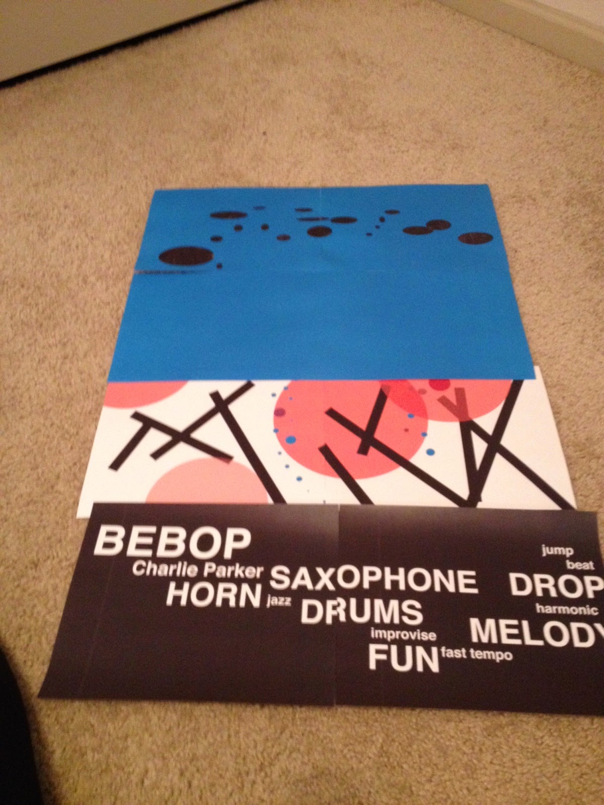
When refining the space I added triangles to the outside and inside walls create color, energy, and movement and reflect these qualities in the music and changed the font on the glass panels. I added icons to the outside area and text to the floor to lead viewers through the space as well as explain the glass panels and space in general. I also changed the location of the door so users have to move throughout the space to get the full experience and picture.
The black lines on the floor represent where the glass panels will be.


Glass Panels:


Title and Icon Refinements

I refined the titles and icons to reflect the energetic nature of the rest of the pieces.


Thursday, April 23, 2015

P2 First Explorations

My first model is meant to portray the ups and downs of Charlie Parker's life through the terrain and movement of the floor as well as the ordered, yet ripped type on the wall.


My second model, and the one I chose to move forward with is meant to portray the ups and downs of Charlie Parker's life and music through glass panels with different colors and positions of graphics.


The following are process pictures of making my models and sketches and notes of brainstorming.


Tuesday, April 21, 2015

P2 Design Intent


For this project I intend to design a spatial experience for Bebop Jazz and the life of Charlie Parker. Bebop Jazz is fast paced, improvisational, and engaging. I would like my space to reflect these words and feelings, the ups and downs of Charlie Parker’s life, and the jumping, improvisational patterns of Bebop Jazz.

I would like to use either words or patterns to imitate the ups and downs of Charlie’s life as well as the highs and lows in the music, specifically Charlie Parker’s song Bird of Paradise. I will use either panes of layered glass with icons, symbols, indexes, or type on them or a varied walking plane to accomplish this.

My visitors should walk away feeling like they have experienced a physical and mental journey through the ups and downs of music and a man’s life. I would also like them to walk a way with a feeling of discovery and adventure after traveling through the space. 

These are schematic drawings of ideas for the previously stated design theme:


These are options for title lockups:


Monday, April 13, 2015

P1 Final Products

My final three final cereal boxes explore the expressive potential of typography through the themes order, energy, and comfort (back to front.) Each of these boxes conveys a different engaging graphic essence defined below.


This box exemplifies order. The communication of this attribute was accomplished through the clean and graphic quality of the lines, typography, and textured paper boxes. The type is set square and even inside each box and the paper texture is juxtaposed by the perfect edges of the squares. A black box was also added beneath the red boxes to give a sense of depth and organizational stacking to this piece. I chose to photograph this box on a black background so the white box would stand out and to further the message of order through the simplicity of the dominant colors, black and white.


This box exemplifies energy. The communication of this attribute was accomplished through a dynamic grid, overlapped text and elements, dynamic hierarchy, and bright and contrasting colors. I chose a simplistic design approach and color scheme to distract minimally from the form. This product was photographed on a pink background to highlight the fun and energetic aspects of the design.


This box exemplifies comfort. The communication of this attribute was accomplished through a the juxtaposition of hand-lettering and mechanical type, an emphasis on positive phrases and facts, and a light but warm desaturated color scheme. I chose a simplistic approach to the design and color scheme to refrain from overwhelming the viewer and focus on key positive facts. This product was photographed on a gray background to highlight the desaturated tones of the piece.