The first thing I did was Google Swedish poster designs for inspiration. I drew a lot of my inspiration from the following posters.
Then I started laying out ideas in my sketchbook.

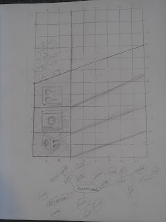
Preliminary Gridded sketch done in class.
Word map done in class to think of words to put on the poster and ideas to incorporate.
First InDesign mock up, done in class. I was trying to repeat the rectangles and did not have the words I planned to use decided yet. Done in class.
Final idea done inside and outside of class on InDesign. I changed my idea from just repeating the rectangles to trying to have the illusion of the alarm clock folding out. I also tried to repeat the circles on the side of the alarm clock (the knobs for volume and tuning) by choosing words with at least one O in them.
I used Thesaurus.com to find synonyms to words that described my object, like smooth and simple, that had the O's I wanted in them.
I had my pictures shot in the photo lab in the Design building. I had them shot at kind of the angle that the shape was trying to convey. I then Photoshopped them to be less yellow and more uniform and put them into my file.
I then built my poster outside of class. I made a couple more tweaks before I turned it in because I cut the far left picture upside down, so the words didn't fit correctly.


No comments:
Post a Comment